
Best Colour Combinations for Outdoor Family Pictures
Choosing what to wear for your family photos can feel like a big decision - but it doesn’t have to be overwhelming. In this guide, we’re sharing our favourite colour combinations for outdoor family pictures, inspired by family sessions that we’ve taken here in Perth. Whether you're heading to the beach, bush, or city, the right palette can elevate your photos and help your family's connection shine through.
Outdoor Family Photo Colour Combo #1: Neutrals + Textures
A soft combination of cream, oatmeal, and gentle grey creates a timeless, calming foundation. What brings this palette to life is texture—think linen dresses, chunky knits, ribbed tops, or gauzy layers. The subtle variation in fabric catches the light and adds dimension without overpowering the photo. Perfect for all locations, this combo keeps the focus on connection and emotion. It’s clean, elegant, and endlessly adaptable. Ideal for families who prefer understated beauty.
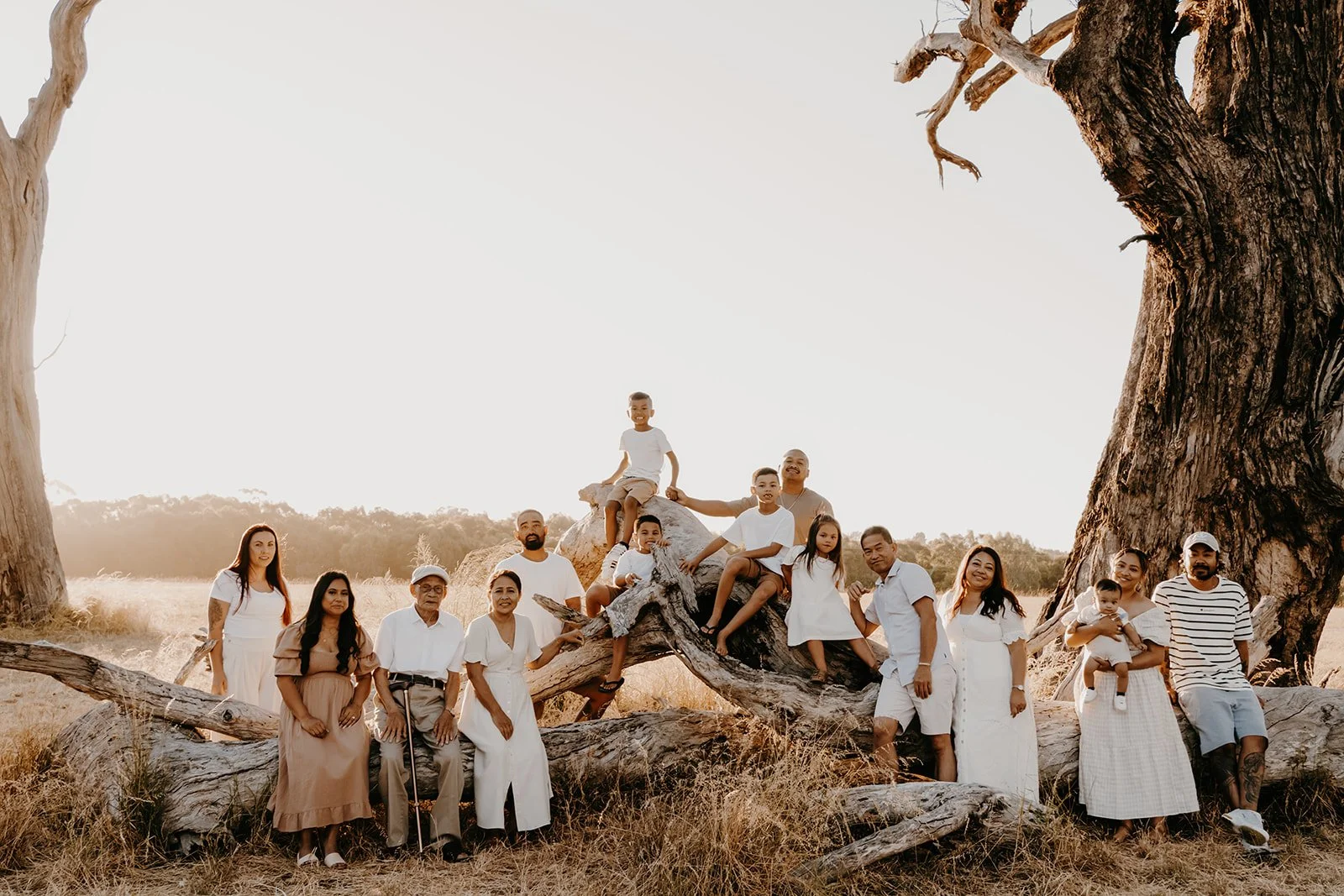

Outdoor Family Photo Colour Combo #2: Earth Tones like olive green
Olive green, clay, rust, and wheat are a natural match for Australian landscapes. These tones feel grounded and authentic, echoing the warmth of the bush, sand, and sunset skies. They photograph beautifully in golden hour or forest settings, especially with layered outfits like chinos, flowy dresses, and textured outerwear. Earth tones work across all seasons and suit a wide range of skin tones. Together, they create a gallery that feels rich, relaxed, and full of heart.


Explore more Pam’s family trip photos wearing an earth-tone colour
Outdoor Family Photo Colour Combo #3: Soft Blues + Neutrals
Dusty blue, soft white, light denim, and warm beige form a cool, calming palette that suits coastal and open-air settings. These colours reflect the ocean and sky, creating a seamless harmony between people and place. Great for light, breezy outfits—linen shirts, cotton dresses, and rolled denim all shine here. The slight contrast keeps things fresh without drawing attention away from your family. It’s a classic choice for relaxed, sunlit sessions.


Outdoor Family Photo Colour Combo #4: Warm Autumn Tones
Mustard, cinnamon, deep red, and soft taupe bring depth and drama in the most beautiful way. This palette is made for golden hour sessions or rustic, tree-lined settings. The richness of these colours creates a moody, cinematic feel that’s still warm and welcoming. Think twill trousers, corduroy pinafores, and woollen jumpers in layered combinations. These tones pop without being loud, adding storytelling depth to every image. A perfect fit for autumn sessions or families drawn to warmth.

Get inspired with Chong’s family photo outfit for your next family photo session!
Outdoor Family Photo Colour Combo #5: Blush + Neutrals
Blush pink create a romantic, delicate palette that’s soft on the eyes and perfect for natural light. These tones shine in floral gardens, green parks, or heritage settings. Light fabrics like cotton voile or washed linen enhance the gentle feel. It’s feminine without being overly sweet, and natural without being too neutral. Ideal for young families or maternity sessions where softness and calm are key. A graceful, subtle combination with timeless appeal.

Outdoor Family Photo Colour Combo #6: Navy + Ivory
This polished palette blends depth with lightness—navy anchors the look and ivory lifts everything with softness. It suits more structured, slightly dressy sessions while still feeling approachable. Great for cityscapes, architectural backdrops, or winter park shoots. These colours allow for layering and personalisation—scarves, vests, and tailored pieces photograph especially well. It’s a confident, clean choice that’s beautifully balanced and striking in the best way.
Stick to a palette of around 3–4 colours, mixing tones across outfits while avoiding identical matches.


How to Choose Colour Combination Based on Season and Location
If you’re not sure where to begin, nature can be your best guide. Each season offers its own beautiful palette—and when your outfits complement the surroundings, your images feel effortless and timeless.
Start by thinking about your location and the time of year, then build a palette with 2–3 base colours and 1–2 gentle accent tones. Lay everyone’s outfits out together to check for harmony across the group. Most importantly, choose tones that suit both your skin and the setting—not just your favourite colour. It’s about creating a look that feels natural, comfortable, and completely you.
Here are some seasonal and location-based ideas to inspire your palette choices!
Beach Sessions
The coast is soft, bright, and windswept—your outfits should feel the same. Think tones like cream, light grey, sage, dusty blue, or blush. These colours reflect the sky, sand, and sea, creating a calm and airy mood. Flowy fabrics like linen or gauze add beautiful movement in the breeze. This palette looks especially dreamy during early morning or golden hour. It's an effortless way to create images that feel light, natural, and timeless.

Are you considering the beach as your family photo location? Check out our guide on Beach Family Photos in Perth – Tips for Outfits, Spots and Poses!
Bushland or Park Sessions
In Perth's bushland and green spaces, earthy neutrals are your best friend. Olive, tan, rust, oatmeal, and denim mirror the natural tones of leaves, bark, and dry grass. These colours help your family blend beautifully with the surroundings rather than compete with them. Textures like cord, knit, and washed cotton bring extra depth to the look. Whether you're playing in the long grass or walking through trees, the tones will feel honest and grounded. It's a warm, relaxed palette that works year-round.

Spring Sessions
Spring in Perth bursts with fresh greens, blooming florals, and soft, golden light. Outfit colours that work beautifully include blush pink, sage, lilac, soft yellow, and ivory. These tones echo the joy and lightness of the season without overwhelming the frame. Light layers—like floaty dresses, rolled sleeves, or knitted vests—add movement and texture. Think gentle patterns like floral prints or soft checks to reflect the playful energy of spring. It’s a lovely season for light-hearted, affectionate moments captured in bloom-filled settings.

Autumn Light
There’s something magic about autumn light—it’s soft, rich, and golden, just like the colours that suit it best. Burnt orange, mustard, chocolate brown, and wine come alive in the fading sun. These tones add warmth and drama without being overpowering. They also look incredibly layered—think scarves, jumpers, and boots for texture and interest. Ideal for sessions among fallen leaves or dried wild grass. This palette wraps your photos in a nostalgic, storybook feel.

Sunset or Golden Hour
Sunset (or golden hour) is when everything softens—light becomes warm and dreamy, and colours glow. Outfits that complement this magic include warm neutrals and muted tones like terracotta, amber, dusty rose, soft taupe, and faded plum. These hues catch the golden light beautifully without stealing the show. Flowing fabrics, open knits, and layered textures create movement that shines in the setting sun. This time of day is perfect for connection and closeness—cuddles, hand-holding, and bare feet feel especially at home here. It’s all about warmth, intimacy, and soft beauty.

You’ll find sunset photoshoot inspiration—outfits, locations, and thoughtful ideas drawn from real families we’ve had the joy of photographing in our guide on Sunset Photoshoot Ideas for Families!
Urban or Architectural Backdrops
In more modern or built environments, keep things clean and tonal with neutrals that pop. Pale beige, grey, or ivory can be paired with deeper accents like navy, charcoal, or emerald. These combinations create contrast without harshness and suit the structure of city settings. Outfits can be more tailored here—collared shirts, blazers, or smart dresses work beautifully. Adding a touch of texture (like wool or denim) helps soften the look. The result feels fresh, polished, and contemporary.
Always take into account the textures too—natural fabrics like linen, cotton, and knitwear work especially well outside.
What to Avoid: Common Colour Mistakes
When planning outfits, a few gentle no’s can help ensure your photos stay timeless and cohesive:
Avoid matching exactly—identical outfits can flatten the image and lose individuality
Skip logos and text—they distract from faces and emotional moments
Be mindful with black—it often looks harsh in natural light and can lose detail in shadows
Steer clear of neon or overly saturated colours—they can clash with natural tones and dominate the frame
Limit high-contrast patterns—a few soft prints are lovely, but too many create visual noise
Instead, focus on tonal harmony, texture, and comfort—when everyone feels good, it shows.
Tips for Coordinating Without Matching
Coordination doesn’t mean being uniform. In fact, your family will look more relaxed and natural if everyone’s style shines through within a shared palette. Try these tips:
Choose 2–3 base colours and let each person interpret them through different garments
Mix solids and subtle patterns (like florals, stripes, or checks) in the same tonal family
Add interest with textures: linen, cable knit, gauze, denim
Layer with cardigans, scarves, or jackets to build dimension
Lay outfits out together before the shoot to check for balance and harmony
When in doubt, neutrals paired with soft earthy tones rarely go wrong—and let your family's warmth take centre stage.
Bring Your Family Story to Life with the Perfect Colour Palette
Whether you're drawn to warm neutrals, soft coastal tones, or rich autumn hues, the right colour palette can bring your family’s story to life in a beautiful, natural way. Each session is a little different—just like every family—and our goal is to help you feel confident, connected, and completely yourselves.
Explore our portfolio to see the magic we create: Family, In-home, Newborn, Maternity, Family Trips, Celebrations, and Extended Family.
We can’t wait to help you tell your story.
Outdoor family photo colour combination FAQs
-
The key is to use patterns sparingly and keep them within your chosen colour palette. Try mixing one patterned piece (like a floral dress or striped shirt) with solid-colour outfits for everyone else. Make sure the pattern uses the same tones as your overall scheme to keep it cohesive.
-
Letting kids express their style is important, but for photos, it’s worth setting a boundary around loud logos or bright neons. Try offering a few outfit options within your chosen palette, so they still get to choose. Accessories like hats or shoes can also be a fun way to let personality shine.
-
Absolutely—as long as they fit well and match the tone of your session. Light-wash or mid-wash denim works beautifully in casual, outdoor settings. Pair with soft knits, textured shirts, or layered tops to balance the look. Avoid jeans that are too dark, distressed, or overly trendy.
-
Definitely. Hats, scarves, layers, and even jewellery can add subtle texture and help tie your colour palette together. Just keep it minimal—accessories should support the story, not distract from it. Neutral tones and natural materials tend to work best outdoors.